Zombie 2

Post a photo to get comments and suggestions on how it can be improved. For best help you should include the relevant EXIF information. (Use "Photo Sharing" if you simply want to share images and are not after feedback.)
User avatar
davidc
Posts: 2410
Joined: Wed 12 Sep 2012, 11:27
Location: location, location.
Contact:

Zombie 2

Postby davidc » Mon 15 Oct 2012, 10:52

As with Zombie 1, although I like the pic and think it's a reasonable shot, I'm trying to think of ways to improve it and make it "pop" somehow...

Image
Cute Zombie by cedarsphoto, on Flickr
Check out my website - davidcandlish.photography
My Top 50 album is here
Mike Farley
Posts: 7316
Joined: Tue 11 Sep 2012, 16:38
Contact:

Re: Zombie 2

Postby Mike Farley » Mon 15 Oct 2012, 19:56

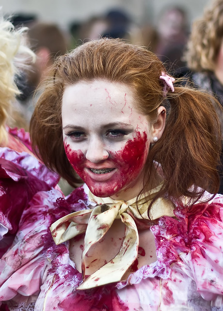
Unlike your first zombie image, the subject here does not seem to realise that she is being photographed at that moment. There is nothing wrong with such candid shots, especially as the young woman will be expecting photographs to be taken at the event, whether she is aware or not. It does present difficulties for you as the photographer as a lot of things will be outside of your control, in this instance the pose, lack of eye contact, the background and the person to the left of the image. Some of the girl's hair has been cropped slightly as well - sometimes it is better to shoot a bit wider and then crop later. With today's high megapixel counts, there is a lot of scope to trim and still have enough pixels left to produce a large image.

I would be tempted to crop the top to remove the distracting light area and to the left to remove the other person's blonde hair, which will make the whole composition tighter. There is just enough of the girl's hair on the right that you might not need to crop in a bit, but it is worth experimenting to see what work's best. You could try slightly desaturating and/or blurring the background to make it less obtrusive, or even desaturate the background in its entirety to turn it monochrome, which will make it both make it less noticeable and help the subject stand out. Finally, you might want to tweak the contrast a bit.
Regards

Mike Farley
(Visit my website and blog - www.mikefarley.net)
User avatar
davidc
Posts: 2410
Joined: Wed 12 Sep 2012, 11:27
Location: location, location.
Contact:

Re: Zombie 2

Postby davidc » Mon 15 Oct 2012, 21:56

This is actually already cropped, I'll post the whole image to show you what I had to work with.

Does the lack of eye contact not fit into the idea of looking out of the frame? (mentioned in the Zombie 1 image)
Check out my website - davidcandlish.photography
My Top 50 album is here
Mike Farley
Posts: 7316
Joined: Tue 11 Sep 2012, 16:38
Contact:

Re: Zombie 2

Postby Mike Farley » Tue 16 Oct 2012, 08:28

davidc wrote:Does the lack of eye contact not fit into the idea of looking out of the frame? (mentioned in the Zombie 1 image)


Normally looking out of the frame works best when the subject's gaze is to the left or right, rather than down as here. If we were aware of what she is looking at, it might provide greater interest.
Regards

Mike Farley
(Visit my website and blog - www.mikefarley.net)
User avatar
davidc
Posts: 2410
Joined: Wed 12 Sep 2012, 11:27
Location: location, location.
Contact:

Re: Zombie 2

Postby davidc » Tue 16 Oct 2012, 08:55

Aha good to know, thank you.
Check out my website - davidcandlish.photography
My Top 50 album is here

Return to “Image Critique”

Who is online

Users browsing this forum: No registered users and 3 guests