Zombie 1

Post a photo to get comments and suggestions on how it can be improved. For best help you should include the relevant EXIF information. (Use "Photo Sharing" if you simply want to share images and are not after feedback.)
User avatar
davidc
Posts: 2410
Joined: Wed 12 Sep 2012, 11:27
Location: location, location.
Contact:

Zombie 1

Postby davidc » Mon 15 Oct 2012, 10:51

Visited the "World Zombie Day" pub crawl this weekend and although I couldn't spend as much time there as I liked, it was a lot of fun and the effort some people had put into their costumes was staggering! A couple of the shots came out usable but was wanting some advice to see how they could be improved. For me they are technically OK (sharp, exposed well) I just think they are lacking a certain something...

Image
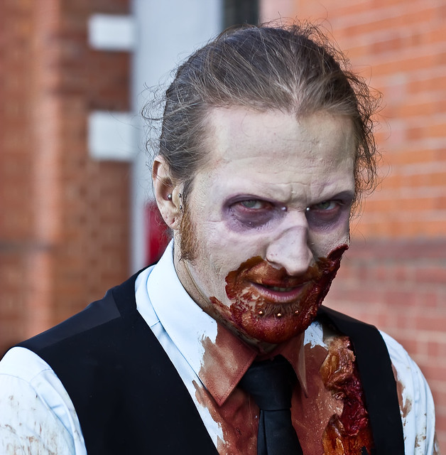
Zombie by cedarsphoto, on Flickr
Check out my website - davidcandlish.photography
My Top 50 album is here
Mike Farley
Posts: 7316
Joined: Tue 11 Sep 2012, 16:38
Contact:

Re: Zombie 1

Postby Mike Farley » Mon 15 Oct 2012, 18:08

Hi David

One option for taking portraits is to ask the subject to look down and stick their chin out, as you have done here. According to Annabel Williams, this is supposed to make people look years younger, although I am not sure that is so important in this instance. :D

There is good eye contact and the subject looks suitably menacing. The main problem is the instrusive background , especially the light structure directly behind the zombie. Due to the way our eyes and brains work, we do not tend to see things in the background when we are concentrating on something else, but anything like that becomes very obvious in the final image, even if it is out of focus. It is definitely worth checking these things before pressing the shutter. You could also have tried a three quarters profile, especially as the left hand side of the man's face looks as though it is a bit more gory. Another option is to have him looking out of the shot. People who have taken this much trouble to "dress up" are usually amenable to having their photographs taken, so you will probably have time to a few shots and work the subject to get the best result.
Regards

Mike Farley
(Visit my website and blog - www.mikefarley.net)
User avatar
davidc
Posts: 2410
Joined: Wed 12 Sep 2012, 11:27
Location: location, location.
Contact:

Re: Zombie 1

Postby davidc » Mon 15 Oct 2012, 21:53

Interesting - I thought there was pretty good separation between subject/background in this example. I'll try a version with the white part of the background specifically darkened and see what the end result looks like.

Agree about the posing suggestions, definitely. Though in this case it was a zombie pub crawl so getting the participants to stop between pubs was never going to happen! The "looking out of shot" notion is particularly interesting and I have another image that does just that but didn't seem as strong on first analysis.
Check out my website - davidcandlish.photography
My Top 50 album is here
Mike Farley
Posts: 7316
Joined: Tue 11 Sep 2012, 16:38
Contact:

Re: Zombie 1

Postby Mike Farley » Tue 16 Oct 2012, 08:21

A zombie on a pub crawl? He was obviously in need of a stiff drink. ;)

I thought there was pretty good separation between subject/background in this example


I presume that you mean the distance between the subject and at the background at the time of capture. If so, it will not have much bearing in the resulting two dimensional image where the eye cannot see the separation. It is always better to avoid these issues at the time of shooting, rather than try to fix it later in Photoshop which can often be a frustrating and time consuming exercise.
Regards

Mike Farley
(Visit my website and blog - www.mikefarley.net)
User avatar
davidc
Posts: 2410
Joined: Wed 12 Sep 2012, 11:27
Location: location, location.
Contact:

Re: Zombie 1

Postby davidc » Tue 16 Oct 2012, 08:52

Mike Farley wrote:
I thought there was pretty good separation between subject/background in this example


I presume that you mean the distance between the subject and at the background at the time of capture.


No, as in specifically on the image - I saw the white region behind him, toned it down and then thought the bokeh was sufficient to clearly separate the two. For instance, it's not an amusing shape that looks like it's growing out of his head like a chimney. Will try toning it down further, but I hadn't expected that to be an issue.

This is an interesting point. I often find that judges see brighter regions of the background and simply state they are distracting which I think is sometimes unfair - there are relatively few cases I've seen where there is a truly distracting area rather than simply a lighter area they feel they can comment on. Is it possible to have a light background that isn't distracting? How can you tell if your image falls into the category where you DO have a bright spot in the background (or blown highlight in the foreground) and a judge will then reward you with a "it doesn't matter in this case" comment. When do you know if you background is distracting or "doesn't impact the image"?

I actually thought the red patch behind his ear was more distracting than the white part and in v2 of the pic I've turned that grey!
Check out my website - davidcandlish.photography
My Top 50 album is here
Mike Farley
Posts: 7316
Joined: Tue 11 Sep 2012, 16:38
Contact:

Re: Zombie 1

Postby Mike Farley » Tue 16 Oct 2012, 19:48

No, as in specifically on the image - I saw the white region behind him, toned it down and then thought the bokeh was sufficient to clearly separate the two. For instance, it's not an amusing shape that looks like it's growing out of his head like a chimney. Will try toning it down further, but I hadn't expected that to be an issue.

This is an interesting point. I often find that judges see brighter regions of the background and simply state they are distracting which I think is sometimes unfair - there are relatively few cases I've seen where there is a truly distracting area rather than simply a lighter area they feel they can comment on. Is it possible to have a light background that isn't distracting? How can you tell if your image falls into the category where you DO have a bright spot in the background (or blown highlight in the foreground) and a judge will then reward you with a "it doesn't matter in this case" comment. When do you know if you background is distracting or "doesn't impact the image"?

I actually thought the red patch behind his ear was more distracting than the white part and in v2 of the pic I've turned that grey!


David

Most of your questions relate to aesthetics and it really is a question of judgement, which will vary according to circumstances. In my view, both the artefact behind the zombie's head and the red patch (which I saw, but did not mention) are hugely distracting. Backgrounds generally need to be as simple as possible and even the pattern of the bricks is not ideal in my view. YMMV. Photography is simultaneously both simple and difficult. Easy to take a picture, tricky to get a good result particularly when the photographer does not have total control of what is in the scene. It is something which only comes with experience.

The best example I can give is in my member's gallery, "Brighton or Bust" which is the first image. It was taken on the Brighton Road by Whitgift School, where Croydon Council seems to think that none of the many lampposts there are complete without at least five signs each. I wanted to show the veteran car in a modern environment, but I felt that the background as shot was too obtrusive. To overcome this, I removed some of the posts, making sure that nothing was behind either man's head, and finally slightly desaturated and blurred the background. I could have gone further, but I wished to retain some context.

http://croydoncameraclub.org.uk/ClubMembersGallery/MikeFarley/MembersGallery_MikeFarley.htm
Regards

Mike Farley
(Visit my website and blog - www.mikefarley.net)
Mike Farley
Posts: 7316
Joined: Tue 11 Sep 2012, 16:38
Contact:

Re: Zombie 1

Postby Mike Farley » Tue 16 Oct 2012, 20:53

After I wrote my previous post, I remembered the furore about a winner of the National Portrait Gallery's annual prize for a photographic portrait. These days, it is called the Taylor Wessing Prize, but back then it was sponsored by Schweppes. I cannot find a particularly large version of the image, so instead I have linked to an article in the Daily Telegraph which has an explanation of why this image won. Quite sensibly, the photographer (Shara Henderson) does not have it on her website, even though she won £15,000 for it. And that was back in the day when £15,000 was £15,000. :D

http://www.telegraph.co.uk/culture/art/3647686/Viewfinder-Girl-with-Baby-by-Shara-Henderson-2004.html

There was a lot of derision about this picture at the time and it is pertinent to this discussion when you look at the dainpipe in the background, although it is not quite growing out of her head. :)

This is just one of the reasons why it is impossible to answer your questions. Different people have different standards and to some a distracting background will be acceptable, to others it will not. In club photography, the latter will usually apply and, as you have noted, most judges would mark down such an image for the "fault". For others, it breaks the "rules" of composition, for which it is to be commended. You pays your money, all £15,000 of it, and takes your choice.
Regards

Mike Farley
(Visit my website and blog - www.mikefarley.net)

Return to “Image Critique”

Who is online

Users browsing this forum: No registered users and 2 guests