Page 1 of 1
My Pride and Joy
Posted: Thu 01 Jun 2017, 08:12
by Nina
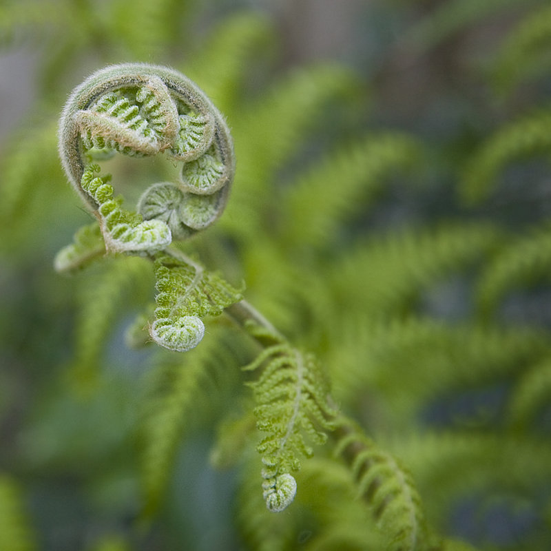
An Australian tree fern has a prime position in my back garden. After the dry spring it was late in bursting into new growth. I love the unfurling fronds so I chose to focus on details. WDYT?
Re: My Pride and Joy
Posted: Thu 01 Jun 2017, 08:14
by Nina
For some reason this appears much to bright, whilst looking good on my own website.

Re: My Pride and Joy
Posted: Thu 01 Jun 2017, 08:32
by Mike Farley
Nina wrote:For some reason this appears much to bright, whilst looking good on my own website.
A link to the image your website to facilitate a comparison would be helpful.
Which browser are you using?
Re: My Pride and Joy
Posted: Thu 01 Jun 2017, 10:17
by Mike Farley
OK, I have done a bit more digging and I see that you have linked from the forum to the image on your website.
Viewing the shot both on the forum and in a colour managed application, it looks identical. That suggests that any differences in the way it is displayed are probably due to the configuration of your viewing device. Or perhaps it is an optical illusion caused by the difference in background colours?
Maybe it could be a fraction darker and a bit more contrast would not go amiss either as it would help the in focus areas stand out better from the background. In my version, I have darkened it very slightly and added a gentle S-curve. The difference is subtle, but makes the subject pop a bit better. (I would have darkened the background a bit more, but I was seeing a colour shift with Photoshop Curves. The implementation of Curves in Lightroom is better in that regard as it has a hue lock.)
As to aesthetic qualities of the picture, I have never found photographing ferns in situ to be especially easy and it looks as though you have encountered similar issues. The problem here is the way you have controlled depth of field. The fern is not straight on to the camera so while there is reasonable differentiation between the top of the fern and the background, that is not the case lower down the where the stalk and some of the fronds are out of focus. I find the way everything merges together to be confusing. Unfortunately, the overall effect is not helped by the bokeh, which I do not find particularly appealing.
If it were mine, I would abandon the square crop and opt for a portrait orientation as shown in my example. Much of what is on the right hand side of the image is not adding anything, rather it emphasises the distracting way the subject is combining with the background. I have also removed the green area at bottom left as it is a jarring element. Both are taking the eye away from where it should be, that lovely fern of which you are rightly so proud. As a further point, although I have not done it, I would slightly darken the edges with a vignette as that too would help direct the eye to the fern.
Re: My Pride and Joy
Posted: Fri 02 Jun 2017, 03:46
by Nina
Thanks for your comprehensive critique Mike and for attempting to show me how you would process the image if it were yours. I see why you chose to crop and I am warming up to the idea. What I was trying to do is show as much as possible of the context (the rest of the tree). I will have another go at processing to see if I can improve it. Not sure about darkening the background, but a little vignette would probably help.
Re: My Pride and Joy
Posted: Fri 02 Jun 2017, 08:22
by Mike Farley
Nina wrote:I see why you chose to crop and I am warming up to the idea. What I was trying to do is show as much as possible of the context (the rest of the tree). I will have another go at processing to see if I can improve it. Not sure about darkening the background, but a little vignette would probably help.
My crop still allows for some context, of course. My usual preference is to get in reasonably tight on the subject matter to direct the eye, but it does depend on circumstances. A square composition would have worked better if more of the image were in focus on the lower right. I am not suggesting a substantial darkening of the background, just enough to make the in focus areas stand out a bit more. My rule for vignettes is that if they are obvious, then it is probably too much. Most of my recent shots have a bit of vignetting applied and there are plenty of examples on the forum.
If it works out, I look forward to seeing an updated version and details of any changes you choose to make.