Postby Mike Farley » Sun 23 Dec 2012, 13:40
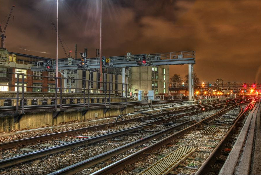
The first thing that I would say that even though this subdued HDR image looks better than some of the more OTT examples which are around, I still find something unnatural about it. That said, I can see the potential for certain types of scene and the lower half of this image conveys the sense that there is a lot of detail. The strong diagonals certainly lead the eye to the right, but unfortunately there is not really anything to hold the attention when it gets there. A train might well work in this situation, particularly if it coming into the scene to counteract the left to right motion created by the tracks and direct the eye back into the image, but on the assumption it would be moving it could not be captured using the HDR technique.
I also find that the top of the image does not work well for me. Once again there is the question about whether highlights distract. For many they do, and there is a particularly "glaring" example right on the edge at top left. Cropping it out or replacing it using either the cloning or healing brushes makes a surprisingly large difference to the imapact of the overall image. Then there is the signal at top right, which is suspended without visible support. Removing it and the blown highlight from the red signal, another distraction, helps to improve matters. It is not really needed as there is enough going on without it.
I have attached an amended version to highlight the possibilities that a bit of post process editing would create. The light coming down from top left still needs a bit of work, but it does add some atmosphere to the scene.
Thanks for posting, especially as it shows a more restrained use of HDR and the possibilities that it opens up.
-
Attachments
-
- Capture.JPG (184.56 KiB) Viewed 2534 times


