Flower studies

Post a photo to get comments and suggestions on how it can be improved. For best help you should include the relevant EXIF information. (Use "Photo Sharing" if you simply want to share images and are not after feedback.)
User avatar
Paul Heester
Posts: 622
Joined: Fri 18 Jan 2013, 13:16

Flower studies

Postby Paul Heester » Thu 26 Jun 2014, 17:04

At our annual exhibition we had a huge raffle where most people came away with some sort of prize. I chose a book of flower photography which has inspired me to try something new. So below are 3 shots taken this morning. I used cuttings from our garden and in the case of the rose used a brown felt background and with the Lobelia used a black storage folder, plus white card. Would welcome any comments on the images and any tips on flower techniques, including pressing which I know nothing about. In both cases I just used a stack of hardback books and left them pressed down on a sheet of glass overnight. I removed the sheet of glass due to reflections and to give the flowers a small amount of height, this helped with the off-camera flash giving shadows.

Image
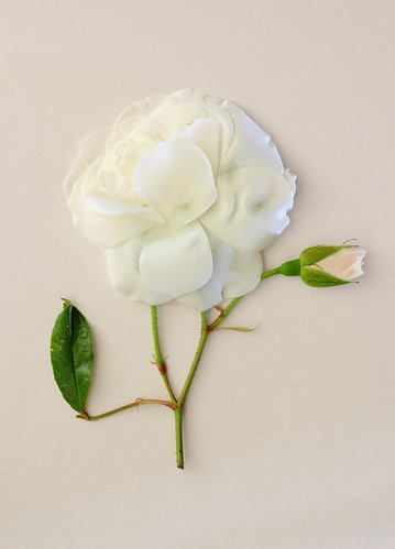
White Rose by Paul Heester, on Flickr

Image
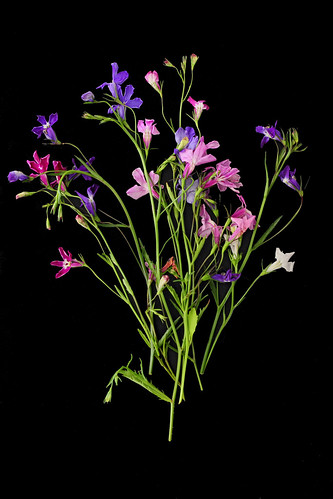
Lobelia Still Life 2 by Paul Heester, on Flickr

Image
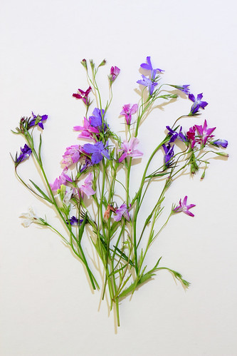
Lobelia Still Life by Paul Heester, on Flickr
Mike Farley
Posts: 7316
Joined: Tue 11 Sep 2012, 16:38
Contact:

Re: Flower studies

Postby Mike Farley » Thu 26 Jun 2014, 19:09

A promising start, Paul.

I am not certain about the background colour for the rose, which is too similar and results in the top of the bloom getting a bit lost. There is some interesting modelling on the right which makes the rose stand out, so perhaps the lighting could be set up to produce this around the whole of the flower? There are some shadows on the right of the rose which look a mite too heavy, so would it be possible to moderate them when you adjust the lighting? Unfortunately, the rose is not quite a perfect specimen and there are some spots on the leaf at lower left which could usefully be cloned out. The leaf also looks a bit awkward in its near vertical position and placing it so that it forms a diagonal might help. You could also try positioning the entire flower as a diagonal and see if that works.

The lobelia shots both suffer from having too many flowers, so while the initial impression is good, the centre parts of the images are a bit of a jumble when you look more closely. A bit of separation would help. I am in two minds about the shadow on the white background. In some respects it helps give a bit of depth, but I also find it a bit distracting. Maybe the profusion of flowers is a factor in that?

I do wonder whether everything is a bit too sharp. Would a bit of diffusion improve matters? Maybe moving the Clarity slider to the left if the images started out as Raw files? I would also try adding a subtle vignette to the shots with the pale background to help concentrate the eye on the flowers. Nothing too obvious, more of a sublimnal effect.

Something else which you could try is placing the flowers on a scanner, which gives some interesting effects similar to what you have achieved here. If you do this, it is recommended that you put a bit of clingfilm over the glass to protect it.

A worthwhile raffle prize if it has inspired you to do this and I am impressed by this first effort. It's certainly worth experimenting further and I look forward to seeing the results.
Regards

Mike Farley
(Visit my website and blog - www.mikefarley.net)
User avatar
Paul Heester
Posts: 622
Joined: Fri 18 Jan 2013, 13:16

Re: Flower studies

Postby Paul Heester » Thu 26 Jun 2014, 20:42

Thanks Mike for feedback.

I agree re the background for the rose. I originally had a sheet of brown felt but it didnt look right and the white card was only real alternative. I will plan my background better in future to complement the flowers. I suspect that as roses tend to face upwards this technique of flattening them doesnt work too well.

I see your point re the Lobelia as well. Its a delicate flower and too many of them doesnt shown that. Will experiment more on shadows but as I think having them completely flat against glass (thus killing any shadows) didnt work from all the other shots I took.

Very good point re vignetting as well.

All told Im happy with this first run and will look to improve on the next occasion. Glad I picked that book now :)
Mike Farley
Posts: 7316
Joined: Tue 11 Sep 2012, 16:38
Contact:

Re: Flower studies

Postby Mike Farley » Thu 26 Jun 2014, 22:45

I was trying white card for some of flower shots last year and it did not always work out well, with its texture being apparent on occasion. I also tried black velvet as a background, but it needs to be completely flat and perpendicular to the lens to avoid reflections. I also found that it picked up small specks which were difficult to remove and could be intrusive if the flower was laid directly on it. I am not using the velvet at present, so you are welcome to borrow it if you want to experiment.

Good luck with the next attempt.
Regards

Mike Farley
(Visit my website and blog - www.mikefarley.net)
User avatar
davidc
Posts: 2410
Joined: Wed 12 Sep 2012, 11:27
Location: location, location.
Contact:

Re: Flower studies

Postby davidc » Fri 27 Jun 2014, 02:57

I like the idea and agree with all your comments thus far too. Interested to see what it'd look like lowering the clarity, I've not found a photo yet where I liked the outcome so keen to see it tried here.

Most of all though I like the idea it's an "endless project", something you can always dip into and keep adding further images. See an unusual flower, flatten it and photo it. I like that :)
Check out my website - davidcandlish.photography
My Top 50 album is here
Mike Farley
Posts: 7316
Joined: Tue 11 Sep 2012, 16:38
Contact:

Re: Flower studies

Postby Mike Farley » Fri 27 Jun 2014, 07:57

Reducing clarity does not work well with every subject, but I did wonder whether it would impart an ethereal quality to these images. It might be worthwhile also to experiment with the other methods of diffusion which are available in Photoshop.

I agree about the project potential of the subject. Boredom could set in, though. ;)
Regards

Mike Farley
(Visit my website and blog - www.mikefarley.net)
User avatar
davidc
Posts: 2410
Joined: Wed 12 Sep 2012, 11:27
Location: location, location.
Contact:

Re: Flower studies

Postby davidc » Fri 27 Jun 2014, 08:24

I think my own feelings about photographing flowers were made quite clear last year :P

Though as was the case then, I still like seeing what others do with the subject!
Check out my website - davidcandlish.photography
My Top 50 album is here
User avatar
Paul Heester
Posts: 622
Joined: Fri 18 Jan 2013, 13:16

Re: Flower studies

Postby Paul Heester » Fri 27 Jun 2014, 16:57

Although I dont have the clarity option in PS I have been playing around. Ive duplicated the layer, added gaussian blur and then reduced opacity of layer and it does give a much softer feel to image. This is a good tip, thanks :) I will continue to experiment.

I think this may be a summer project given the bright weather and availability of flowers. Will be visiting Paperchase for some coloured papers and looking for other props to expand on "Project Flora" (or somesuch self-important title :roll: )
lobeliablack.jpg
lobeliablack.jpg (133.41 KiB) Viewed 3846 times


lobeliawhite.jpg
lobeliawhite.jpg (170.31 KiB) Viewed 3846 times

Return to “Image Critique”

Who is online

Users browsing this forum: No registered users and 2 guests