Lost & Alone

Post a photo to get comments and suggestions on how it can be improved. For best help you should include the relevant EXIF information. (Use "Photo Sharing" if you simply want to share images and are not after feedback.)
User avatar
davidc
Posts: 2410
Joined: Wed 12 Sep 2012, 11:27
Location: location, location.
Contact:

Lost & Alone

Postby davidc » Mon 23 Jun 2014, 02:40

exif -

1/40th sec
f1.8
50mm
iso 5000

Though the original shot was a fair bit brighter, with the lighting & expression on her face I decided straight away to go for a more moody shot. Converted to mono (using a trial of silver efex pro 2) and added a vignette in photoshop. Thoughts appreciated!

Image
Lost & Alone by cedarsphoto, on Flickr
Check out my website - davidcandlish.photography
My Top 50 album is here
Mike Farley
Posts: 7316
Joined: Tue 11 Sep 2012, 16:38
Contact:

Re: Lost & Alone

Postby Mike Farley » Mon 23 Jun 2014, 10:46

I concur awith your views about the lighting on her face and her expression, which are what make the image for me. It looks as though her face is being lit by her phone, but unfortunately it has also caught part of her hand and being brighter than her face it tends to drag the eye away. I would definitely at least darken that area or even remove it entirely. As for the rest of the shot, I find it a bit busy and there are lots of distracting highlights. I don't think that the structure on the right adds much; I would crop it out and turn the shot into a vertical format if it were mine. Overall it has been well seen, but could have benefited either from going in closer or using a longer lens, accepting that the former approach would bring its own issues. If this is an example of the type of shot that you are going to get to get in Singapore, I look forward to seeing more.
Regards

Mike Farley
(Visit my website and blog - www.mikefarley.net)
User avatar
davidc
Posts: 2410
Joined: Wed 12 Sep 2012, 11:27
Location: location, location.
Contact:

Re: Lost & Alone

Postby davidc » Tue 24 Jun 2014, 02:03

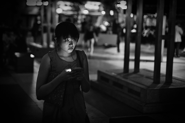
Agree totally about the bright spot on the hand and I'll try a version where that is cloned out - I might even darken it to the stage where the phone is removed too as it then makes you wonder where the lighting is from.

For the background/wider shot I was in two minds about it too like you suggest. However I decided I needed to keep it otherwise it'd just be a girl with a single spotlight on her face and, if I remove the phone glare on her hand, a cropped version might mean her head would be pretty much hanging in near blackness! :) I'll try it though and will post the results. I'll also clone out the headphone cable on her neck too.

Instead I think I'll go somewhere between. The bokeh top left that has been caught and dimmed by the vignette needs to go and I'd probably delete some of the other spots near the edge too but I think keep the rest of the background in - maybe darkened a bit - adds context. Possibly crop right to remove the chap in the white jacket?

This was taken with the "toy" Canon 1.8 50mm and I'm finding I'm really enjoying this focal length on full frame!

Finally, the title. I am reconsidering and think I might just call it "Lost" now, someone said the "Alone" part added a more sinister undertone than was needed. Any other suggestions, be it on title or improvements? We signed the tenancy agreement for our new condo last night so I should have time tonight to work on more photo stuff :)
Check out my website - davidcandlish.photography
My Top 50 album is here
Mike Farley
Posts: 7316
Joined: Tue 11 Sep 2012, 16:38
Contact:

Re: Lost & Alone

Postby Mike Farley » Tue 24 Jun 2014, 08:22

Your suggested changes seem sensible and I look forward to seeing the next version. I agree that it might be necessary to retain some context and given the girl's position a square crop could work. If you are going to change the title, Alone would be better, although it is fine as it is. Whilst clearly not lost as in not knowing where she is, she does appear to be lost in her thoughts. That's probably a subtlety which will elude most, though.

The 50mm focal length on full frame gets a lot of undeserved stick due to its normal perspective, which is somehow perceived as boring. Tell that to the famous photographers of the past such as Robert Capa who used them for much of the time. I find the equivalent focal length of 25 on m43 (2x crop factor) works well for me, especially using it at the wider apertures. The performance of Canon f/1.8 belies its low price and plastic construction. Enjoy.
Regards

Mike Farley
(Visit my website and blog - www.mikefarley.net)

Return to “Image Critique”

Who is online

Users browsing this forum: No registered users and 2 guests