By Candlelight

Post a photo to get comments and suggestions on how it can be improved. For best help you should include the relevant EXIF information. (Use "Photo Sharing" if you simply want to share images and are not after feedback.)
User avatar
davidc
Posts: 2410
Joined: Wed 12 Sep 2012, 11:27
Location: location, location.
Contact:

By Candlelight

Postby davidc » Thu 16 Oct 2014, 09:08

I'd appreciate some critique on this one please. I feel it has potential for improvement with post processing.

6d + 24-70 Tamron @ 24mm
f6.3
1/30th sec
ISO 1600

Image

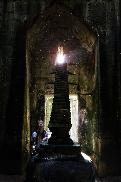
By Candlelight by cedarsphoto, on Flickr

When I get home I will show a straight up RAW conversion to show the start point but this is my first pass.
Check out my website - davidcandlish.photography
My Top 50 album is here
User avatar
Peter Boughton
Posts: 335
Joined: Wed 22 Aug 2012, 13:35
Contact:

Re: By Candlelight

Postby Peter Boughton » Thu 16 Oct 2014, 22:29

Not sure this is what you're asking since it's more composition than processing, but I find it more comfortable mirrored so the boy is on the right, and (to a lesser extent) the top of the arch being so close to the edge of the frame is a little off-putting - a small bit of space above it (e.g. about as much as there is floor at the bottom) would probably help.

Maybe experiment with increasing contrast/clarity?

I'd be tempted the remove some of the specks that are outside the main area - definitely the one on the very edge of the frame, probably a few around the edge of the arch, unsure about the ones in front of the bottom half of the spire.
User avatar
davidc
Posts: 2410
Joined: Wed 12 Sep 2012, 11:27
Location: location, location.
Contact:

Re: By Candlelight

Postby davidc » Fri 17 Oct 2014, 09:27

Cheers for the feedback :) Some questions while I work on a version with the changes you've suggested

I'll try a version that is flipped and post it but I'm not sure how to add additional height onto the image - do you know why it's off putting?

For contrast/clarity, do you mean lowering it or raising it? The image is already fairly contrasty between the (intentional) brighter areas and I've added a vignette to draw focus away from the edges onto the lad & the "candle". I could try boosting clarity a bit more if you think more of that effect would be useful?

Good spotting on the specks, I thought I'd removed all the distracting ones so will have another go. Off to Burma for a week now so the processing may have to wait a bit though :)
Check out my website - davidcandlish.photography
My Top 50 album is here
User avatar
Peter Boughton
Posts: 335
Joined: Wed 22 Aug 2012, 13:35
Contact:

Re: By Candlelight

Postby Peter Boughton » Sun 19 Oct 2014, 14:00

Was trying to work it out, but still not sure why it bothers me. (It does, just can't determine the reason.)

To add the height, expand the canvas size with anchor set to the bottom, then it's basically a question of cloning in bits of wall - Content Aware Fill might be ok here, or another option is to paste a flipped version of the image, then clone along the seam so it looks continuous, and remove any other bits that look odd. Of course the vignetting would need to be removed before either method and re-added afterwards.


I could try boosting clarity a bit more if you think more of that effect would be useful?


Yeah, that's what I was thinking - not sure if it's what you're after, but I like the feel it gives here. Possibly a bit over-done and/or selectively apply it to prevent the outer walls being brightened too much, but by way of a very quick demonstration...
 
Attachments
14921918344_ee57e625f0_z.clarify.jpg
14921918344_ee57e625f0_z.clarify.jpg (107.52 KiB) Viewed 4435 times
Mike Farley
Posts: 7316
Joined: Tue 11 Sep 2012, 16:38
Contact:

Re: By Candlelight

Postby Mike Farley » Sat 25 Oct 2014, 13:36

A delayed response as this was posted while I was away last week.

My thoughts are that there is a lot of potential in the scene, although it poses a number of challenges, both technical and aesthetic. The most obvious issue is the extreme range of the lighting conditions, from dark to light, culminating in a burnt out highlight at the top of the column. This has also resulted in a red halo around the light source. Burnt out highlights are not necessarily a no-no, although the title of the image is "By Candelight" and I am guessing this is where the candle(s) are. Unfortunately the blown highlights and halo rather obscures this. The other bright areas in the image have been quite well handled, although there is a bright spot at the base of the column on the right which looks to be over exposed. Possibly this could have been handled by making two or more exposures biased towards each of the different light levels and merging them later. You might still have had issues with the red halo, although possibly the artefact could be used to give an additional glow to the illumination from the candles.

You have opted for a symmetrical composition, with the young man at bottom left of the central column. Like Peter, I wonder if he would have been better placed on the right. Probably because the person is blocking the light, he is partially in shadow and the right hand side is lighter. This results in the eye being attracted away from him and reduces the impact of the figure. I do wonder if we actually need the symmetry? It has resulted in the very large column being centrally placed and acting as a barrier. For me, the story is about the young man being in a small temple area looking up at the flames. Could the shot have been taken from a different angle to make more of this aspect? I am not sure that the straight on approach is doing you any favours here. Cropping the right hand side might work, but you do lose the sense of place by doing this.

Then there is a young man himself, who has a camera around his neck. He is not someone who has come to the temple in reverence, but a sightseer and this reduces the impact. Yes, it tells a story, but maybe not the best one. Appreciating that this was taken in a different country and there might have been a language barrier, but would he have been willing to pose for you? There is a strong diagonal formed by him looking up at the flames and I feel that the shot would have been made stronger by emphasising this.

For me, the shot does not really work, but it does offer a number of learning opportunities should you encounter a similar situation in the future. Thanks for posting, as it has given me a number of things to think about.
Regards

Mike Farley
(Visit my website and blog - www.mikefarley.net)
User avatar
davidc
Posts: 2410
Joined: Wed 12 Sep 2012, 11:27
Location: location, location.
Contact:

Re: By Candlelight

Postby davidc » Sun 26 Oct 2014, 01:43

Cheers both for the feedback, I've been away too, only just returned from Myanmar late last night with a ton of photos I need to go through!

As promised, here's the original - basically a straight up RAW conversion -
By Candlelight_original.jpg
(1.94 MiB) Not downloaded yet


Some notes on the scene itself. This was in the middle of a temple and the column is a rather unsubtle male fertility symbol :) However, the temple wall behind it has caved in yielding a shaft of sunlight which, from the right angle, tops the column and makes it look like a candle (hence the title). There is no other source of illumination than the sun in this scene.

List of changes I made in the first pass -

    * Pespective correction in lightroom
    * Addition of "dust motes" in the air
    * Addition of lens flare to create the halo
    * Addition of light rays from the candle top (albeit extremely subtle)
    * Selected contrast changes - basically I felt the edges of the frame added little to the shot so de-emphasised them to keep attention in the centre
    * Application of a couple of filters in Perfect Effects & Analog EFX

What I think I'll take away from the feedback is

    * Flipping the image to put the guy on the right
    * Trial brightening the doorway area somewhat & cloning out some of my more wayward dust motes It's already quite a contrasty scene, by design & looking at the histogram, so adding clarity would only increase that? Also, I think overuse of clarity tends to look rather obvious and, on people, make a "frankestein's monster" effect so may pass on that ultimately, though I will experiment.
    * Photoshop some monk's robes onto the guy (maybe ;) )
    * Burn the bright spot on the base of the pillar (checking the raw file it doesn't seem to be completely burnt

Personally I'm not so sure I need to extend the canvas, I'm not adding more at the top would benefit the central theme. The highlight at the top of the pillar is intentional and pretty much forms the basis for the image so not something I can or would want to change. I did shoot some HDR versions of the scene and having a non-burned out top of the candle shows blue sky that just doesn't work at all. I totally agree a club judge would probably have issue with a blown highlight I don't think it's a problem when used selectively and deliberately for dramatic effect (same with black shadows and negative space :)).

Sadly I couldn't control the other visitor to the temple and getting him to pose would have ruined the candid nature of his pose. I'm not sure how I can emphasise the diagonal of him looking at the pinnacle though?

Cheers again for the feedback, hopefully seeing the original image will show what I had to work with to begin. I don't think the version I posted originally will be my final exhibition-standard version so will factor in some of the feedback for that and tweak some of the filters I've applied.

Once I get through over 100gb of myanmar photos :)
Check out my website - davidcandlish.photography
My Top 50 album is here
User avatar
davidc
Posts: 2410
Joined: Wed 12 Sep 2012, 11:27
Location: location, location.
Contact:

Re: By Candlelight

Postby davidc » Sun 26 Oct 2014, 02:05

I came back to this thread a little while after posting as I was a little worried that suggestions for improvement were made and I may not have answered all of them or stated I hadn't agreed etc.

Just wanted to check that no one was offended and that the advice received was definitely taken onboard, even if ultimately I don't agree.

For me, the value of the image critique section is firstly the chance to get other's thoughts on it, but then also their critique AND the chance to respond to that critique. For example, Mike said that the candle effects were lost which even though there ARE no candles, made me realise that while the central pillar stuck out as looking like a candle to me, maybe it didn't to others or that the title was misleading.

Being able to see that, and also have a back and forth discussion, is extremely useful and very much valued. Infinitely more so than the 30 secs of exposure a judge gives it :)
Check out my website - davidcandlish.photography
My Top 50 album is here
Mike Farley
Posts: 7316
Joined: Tue 11 Sep 2012, 16:38
Contact:

Re: By Candlelight

Postby Mike Farley » Sun 26 Oct 2014, 13:15

davidc wrote:
..... the column is a rather unsubtle male fertility symbol.

Otherwise known as a lingam.

davidc wrote:
... the temple wall behind it has caved in yielding a shaft of sunlight which, from the right angle, tops the column and makes it look like a candle (hence the title).

I must admit that the subtlety of the column being the "candle" had escaped me; I guess that it would be similar for many others, judges included (who often seem to need the obvious pointed out to them in image titles).

davidc wrote:
    * Pespective correction in lightroom
    * Addition of "dust motes" in the air
    * Addition of lens flare to create the halo
    * Addition of light rays from the candle top (albeit extremely subtle)
    * Selected contrast changes - basically I felt the edges of the frame added little to the shot so de-emphasised them to keep attention in the centre
    * Application of a couple of filters in Perfect Effects & Analog EFX


Looking at the original shot, my feeling is that most of the changes you have applied have detracted from the image rather than enhanced it, the dust motes and halo in particular. As shot, it had an atmosphere which has been lost with the changes.

As I said at the outset, I think that there was potential in the scene, but I do not feel that you successfully captured it for the reasons previously given. I can see why you are attracted to the shot, but for me it is not working and it is one I would ditch and chalk up to experience. I suspect that it would have worked better if you had shot it from an angle rather than head on and not included so much in the scene.

This is a suggested crop, which is not ideal but it does slightly reduce the overwhelming presence of the column and emphasises the diagonal between the person and the light at the top.

By Candlelight_mf_crop.jpg
Suggested crop
By Candlelight_mf_crop.jpg (163.92 KiB) Viewed 4382 times
Regards

Mike Farley
(Visit my website and blog - www.mikefarley.net)
Mike Farley
Posts: 7316
Joined: Tue 11 Sep 2012, 16:38
Contact:

Re: By Candlelight

Postby Mike Farley » Sun 26 Oct 2014, 13:26

davidc wrote:I came back to this thread a little while after posting as I was a little worried that suggestions for improvement were made and I may not have answered all of them or stated I hadn't agreed etc.

Just wanted to check that no one was offended and that the advice received was definitely taken onboard, even if ultimately I don't agree.

For me, the value of the image critique section is firstly the chance to get other's thoughts on it, but then also their critique AND the chance to respond to that critique. For example, Mike said that the candle effects were lost which even though there ARE no candles, made me realise that while the central pillar stuck out as looking like a candle to me, maybe it didn't to others or that the title was misleading.

Being able to see that, and also have a back and forth discussion, is extremely useful and very much valued. Infinitely more so than the 30 secs of exposure a judge gives it :)


You worry too much. ;)

One of the benefits of this forum is that we know each other in real life and have an understanding of the other person's motivations. Too often online image "critique" is of the "nice shot" variety and there is no honest feedback for fear of causing offence. Not many want to get involved in a flame war. I certainly would never have written about your shot in the way that I have if I were dealing with a stranger or believed that there were others on the forum who would think I was being malicious and leap to your defence.

I fully support your views about the value of such advice. Let the critique continue, I say.
Regards

Mike Farley
(Visit my website and blog - www.mikefarley.net)
User avatar
davidc
Posts: 2410
Joined: Wed 12 Sep 2012, 11:27
Location: location, location.
Contact:

Re: By Candlelight

Postby davidc » Sun 26 Oct 2014, 14:20

I always err on the side of caution with forums. Far, far too easy to be misinterpreted with only the written word :)
Check out my website - davidcandlish.photography
My Top 50 album is here

Return to “Image Critique”

Who is online

Users browsing this forum: No registered users and 5 guests